 Sign In
 Create Account


You may have already noticed it live in the last couple of days, but here is the official reveal:
After over a month of work, we are very proud to announce that The SmackDown Hotel website is now fully Responsive!
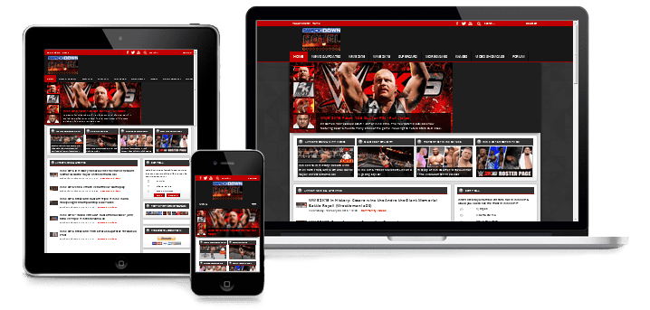
To give you a little introduction, just in case you don't know exactly what "Responsive" means: it means the website adjusts to always fit the screen size on which it's viewed, providing an optimal viewing experience, easy reading and navigation across all devices (mobile phones, tablets, laptop and desktop computers).
I'll be honest with you. In the past, I have always been hesitant about even trying to accomplish this. Not because I hate modern mobile devices (or do I!?), but because with the sheer amount and variety of content we have on the website, I always thought it just couldn't be done. How do you fit the Roster Pages on a mobile screen? Or what about each individual Image Gallery? How do you properly resize all the elements? Not to mention, knowing the foundation of the website and components, it was going to be very difficult from a coding standpoint.
So despite being aware that we now live in a mobile era where smartphones are more popular than computers and having a mobile-friendly website has become critical, I always "gave up" on the idea. "It's just impossible" (words that Simone knows very well, as I often tell him about some convoluted SDH idea of his, before promptly proceeding to find a way to do it... It has become a running joke!)
But then, with my knowledge increasing throughout the years, I realized that with enough patience, commitment and quite a bit of insanity, I could be able to do it. I surrendered and said, let's do this.
Up to this day, the website layout, the plugins and all the content we made were built to be displayed with fixed dimensions. So when I started the project, I knew exactly what I was getting into. Making the website mobile-friendly was going to be a huge undertaking.
Because, like you probably gathered from above, if I was going to do this, I wanted to do things right. I certainly wasn't going to just create a "separate" mobile version with stripped-down functionality, and I didn't even want to settle with doing what I've seen in most cases on the internet, where the experience is device-specific and page elements suddenly reshuffle and snap into place when the window is resized. It's fine, but I personally find it disorienting for the user and sort of "cheap".
I wanted to ensure that the site hierarchy remained intact, without sacrificing any of the features or content. And I wanted it to be truly responsive, with the layout and EVERY page of the website to smoothly scale and adapt its content to ANY screen as device widths change, from desktop to mobile devices and anywhere in between, past, present or future. (here you can see an animation that illustrates what I mean with the difference between smooth and snap design)
Making the website fluid and achieve this level of flexibility wasn't an easy task: it required to completely rethink everything and overhaul both the foundation and each component of the website.
What I mean by "rethink"? That everything needed to be replaced with modern styling and converted to work with percentages and proportions, instead of fixed pixels. It has been a great challenge and a process where imagination and vision played an equal part as technical execution, and it was also a learning experience with the need to find and implement solutions and tricks as I went by (although I'm not going to reveal all my secrets!  )
)
And at the end, I can say it was all more than worth it. Not only for the improved user experience on mobile devices, but also simply because the final result is just... so rewarding. I could almost spend all day resizing browser windows on SDH and proudly watch the content beautifully adapt at half-width or any width!
Here are just a few example pages:
- Homepage: http://www.thesmackdownhotel.com/
- Images Section: http://www.thesmackd...el.com/gallery/
- Screenshots Gallery: http://www.thesmackd...nshots/ps4-xb1/
- Renders Gallery: http://www.thesmackd...we2k15/renders/
- Video Gallery: http://www.thesmackd...tel.com/videos/
- Roster: http://www.thesmackd...wwe2k16/roster/
- Arenas: http://www.thesmackd...renas-full-list
- Embedded Images: http://www.thesmackd...ils-screenshots
- Embedded Videos: http://www.thesmackd...ler-kevin-owens
- Also take a look at the Navigation Menu at the top!
While we were at it, during the process we also took the opportunity to make several other improvements across the board, update the SDH Logo, create favicons tailored for each device, develop a new "more articles" interface, a "back to top" button, improve overall speed and performance of the website, and more additions.
Considered the huge volume and variety of content, there still are a few more things to polish, and here's where your feedback becomes crucial! As you browse around, let us know if you find anything that may not be displaying correctly or that could be improved!
Please note that the "responsiveness" has currently not been implemented in the sections previous to WWE '13 (the ones with the old "dark scheme"), those will be adapted after this initial phase of testing, where the website will be continually monitored and optimized based on your feedback.
And for those wondering if an improved mobile experience will also be coming to the SDH Forum anytime soon... YES, it will! We plan on covering that as well in the next few months.
Finally, me and Simone would like to thank you for your continued love and support, we hope you enjoy the huge update and we wish you a happy navigation on the new, constantly improving and evolving SDH Website. Happy resizing!
 Back to top


