The cover reveal is always a big deal each year and there have been some fantastic covers in the series, so I thought it would be fun to look back at all the past Game covers and rank them from worst to best.
This only includes the main series of WWE Games which would be WWF SmackDown! - WWE 2K23, so the side games such as WWE 2K Battleground, WWE All Stars, etc. are excluded.
This will only include the official North American box art of the game as other regions had different covers for certain games. Also, alternative or special edition covers will not be included.
The factors that were considered when going through the rankings were the image and design of the cover itself, what it meant at the time of its release, and how it relates to the game. The quality of the game has no impact on the overall rankings.
Just like any list, all of this is subjective and you may have a completely different opinion than this, which makes it even more fun to do a ranking list.
23. WWE SmackDown vs. Raw
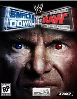
Starting off the list is the beginning of the Smackdown vs. Raw Series. This is literally a close-up of Vince Mcmahon’s face and nothing more. Yes, he does have one red eye and one blue eye to symbolize the Smackdown and Raw colors but there are so many better ways of capturing that element of the brands, as we will see later down the list.
I don’t think anyone wants to have Vince’s face that close to them so the image is just unsettling and odd. It also does nothing to promote the game itself as the eyes are too subtle. Not to mention Vince is very sweaty in the image for some reason.
22. WWE 2K16
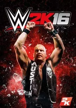
In a vacuum, this image is not terrible, as it is just a signature Steve Austin pose, but it made no sense for Austin to grace the cover of a game that came out in 2015 after being retired for over 12 years at that time.
He was the focus of the showcase mode but that doesn’t mean he has to be on the cover. WWE 2K16 should have been focused on the full-time stars at the time instead of mostly promoting a legend that has not wrestled for over a decade, so it simply did not make sense for this to be the cover of the game the year it came out.
21. WWE 2K23
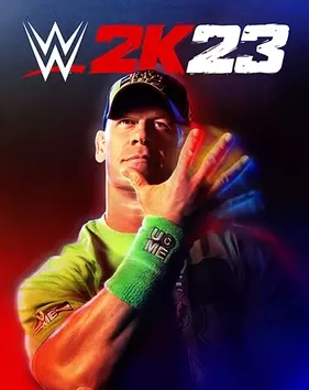
Similar to WWE 2K16, the image is not terrible, but why is John Cena on the cover of the game this year if he has been a part-timer for years? He is the only superstar to have a solo cover twice during the 2K era and I just think so many other superstars could have taken that place such as Cody Rhodes, Drew McIntyre, and The Bloodline, among others.
WWE 2K has been promoting the reinvention of WWE games but keeps going back to the past, so there are some mixed messages in the marketing when you look at the image for WWE 2K23.
20. WWF SmackDown! 2: Know Your Role
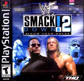
Okay, so there is just a lot going on in one image here. We have The Rock and Triple H as the focus which is great, but then you have Chris Jericho doing his signature maneuver at the side, and then you have the Undertaker in blue which blends in with the color of the background, so it's just very messy here.
From an aesthetic standpoint, why are The Rock and HHH in color but Taker is faded into the back in blue? I think there could be some uniformity between the stars to make this cover come together.
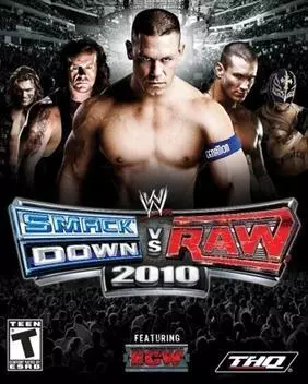
17. WWE SmackDown vs. Raw 2009
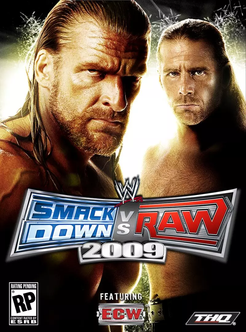
The focus of WWE Smackdown vs. Raw 2009 is the improved tag team wrestling gameplay, which is why we have DX on the cover, but the game is still called ‘’SMACKDOWN VS. RAW’’. But at least they did focus on the tag element of the cover since that is what they are going for.
I just think you could have done so much more here such as having multiple teams on the cover instead of just DX, and the placement of HHH and HBK seems a little off. HHH feels like his face has been zoomed in and Michaels is more of a side character, so the whole image feels incomplete and sort of lazy.
18. WWF SmackDown!
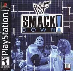
The very first game in the series and while it is quite similar to the game mentioned above, at least everything is one color here so it is more consistent. The problem is, the Stars do not stand out due to the colors.
The entire cover is blue, so it just does not seem very creative when you could have done so much more or just added at least more colors. I still say the image is not bad considering the time it came out, but it does not hold up today and is very much a product of the time.
17. WWE SmackDown vs. Raw 2011
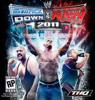
The weird thing about WWE SmackDown vs. Raw 2011 is that the European and Mexican cover arts were significantly better than the US Cover. I am not really sure why there are multiple covers based on the region but for the US version, it is a little confusing as to why the Miz and Big Show are on the cover for the time it was released.
Big Show was not doing anything of importance in 2010 and although The Miz was Mr. Money in the Bank in the second half of 2010, he is holding up the United States Title in the image. Even though The Miz was a rising star, he was still promoted as a mid-carder on the cover (since The Miz became World Champion after the release of the game), so it is odd that he is one of the three superstars they chose for the US cover.
16. WWE 2K14
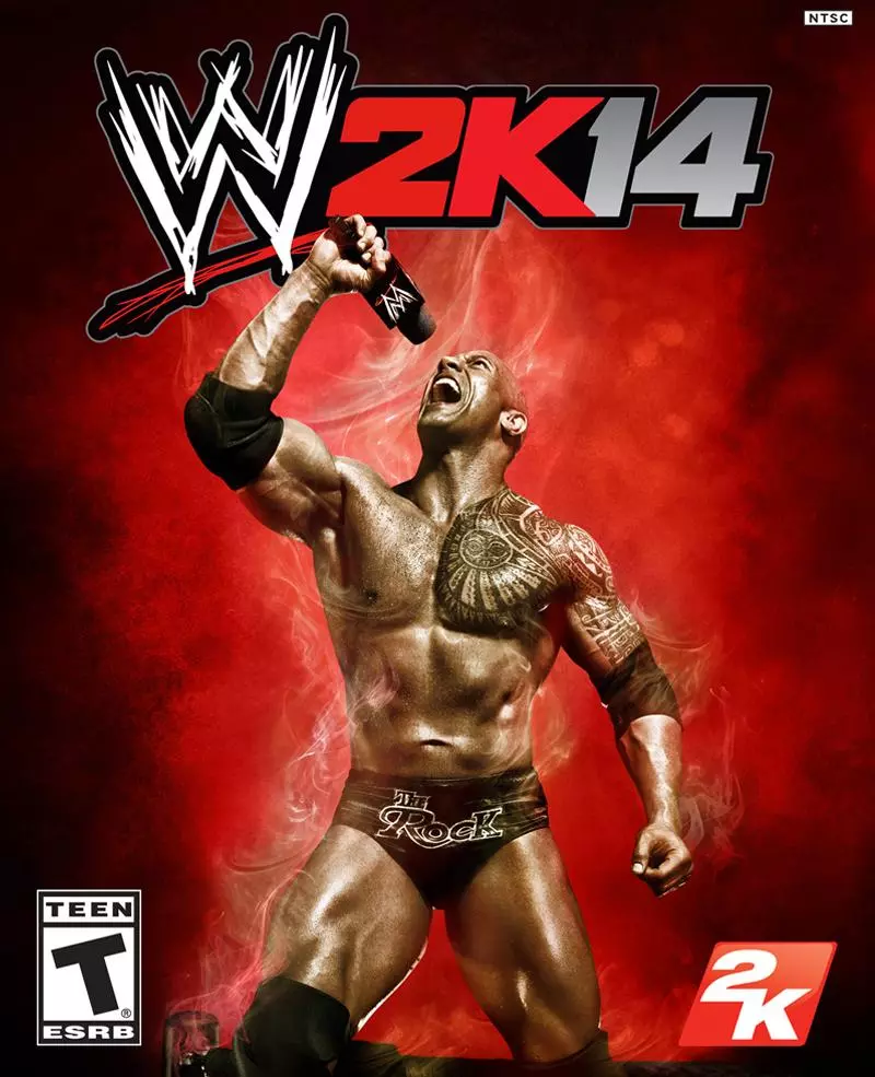
Another part-timer is the cover star of a game that is supposed to signify 2014. At least with The Rock, he was still a big part of WWE at the time as he main-evented Wrestlemania the year this game came out (2013) so this gets somewhat of a pass.
Now the cool thing about WWE 2K14 was that there is an alternative cover with Daniel Bryan who was the hottest superstar at the time, so 2K did give the fans what they wanted, but just not as the official cover of the game, and I think it's pretty clear they should have just stuck with Bryan as the main cover.
15. WWE 2K22
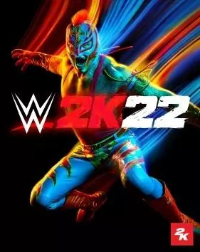
After a long absence, WWE 2K was finally back with WWE 2K22. They decided to have Rey Mysterio be the solo star and the image certainly sticks out and is vibrant and creative with the various colors.
The reason it is not higher on the list is that the focus of WWE 2K22 was a reform for the series and the tagline was ‘’it hits different’’ but we still got a cover in line with every other WWE 2K game. I think it was the perfect opportunity to go in a different direction that suits the tagline and theme and abandon the solo cover for good, but they decided to stick with it, but at least the image is pretty eye-catching.
14. WWE 2K18
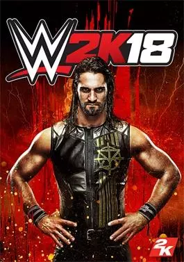
After years of veterans and legends being on the cover, we finally had a fresh face for the box art for WWE 2K18. Seth Rollins is one of the best wrestlers on the planet and was already an established main-eventer, so it was great to see 2K finally embrace the current stars and push them as the main attractions.
As for the image itself, it is just a generic Seth Rollins pose which makes for a pretty bland image. They could have done more with the cover to make it pop which surely would have made it higher on the list, but at least we got the right person on the cover for that year.
13. WWE 2K17
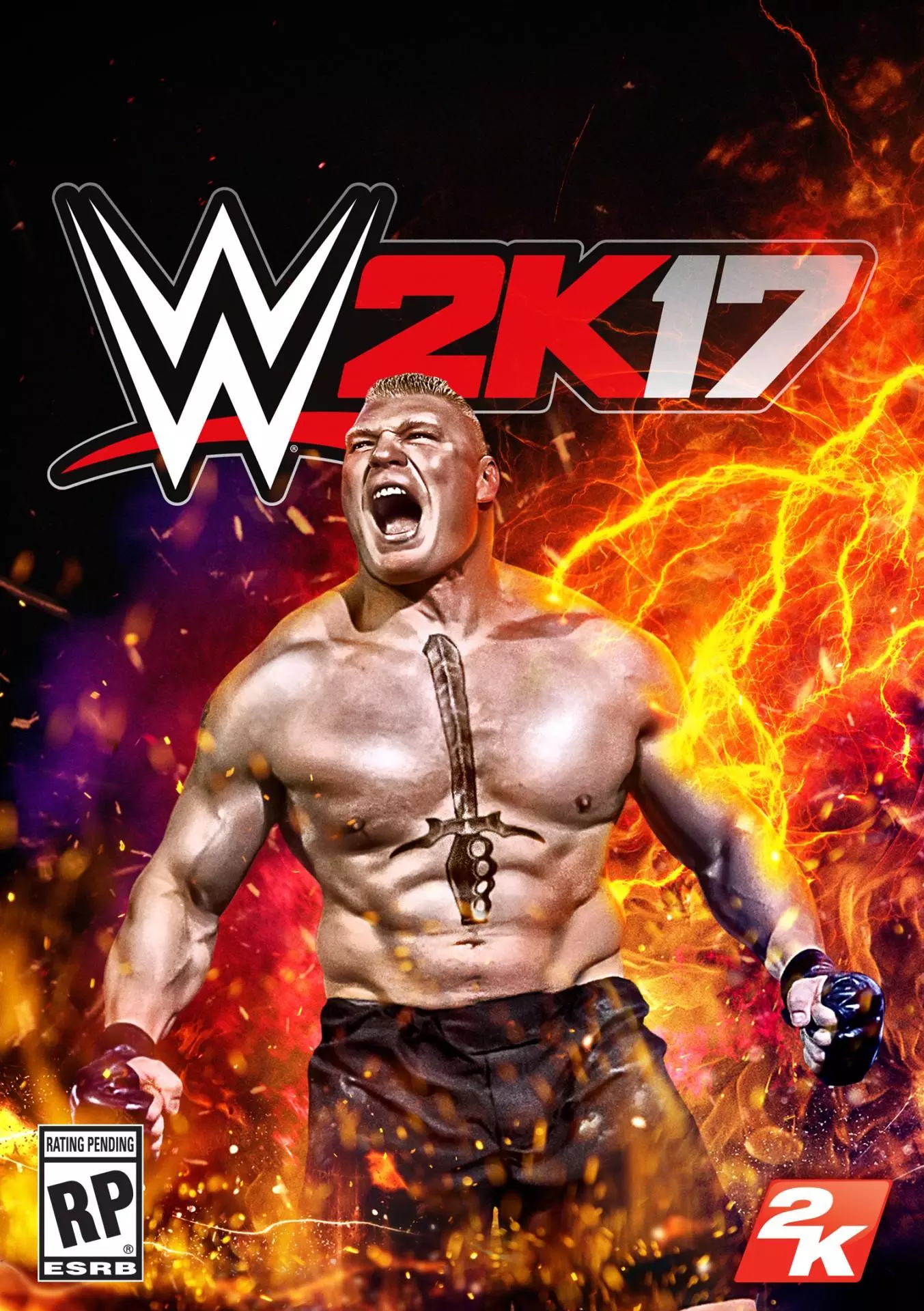
Although Brock Lesnar is a part-timer, this cover actually makes sense compared to some of the others. He was a dominant force at the time and was essentially unstoppable, so it was only a matter of time until he had a solo 2K Cover.
He was still an active roster member as he would be part of the major shows and held the World title, defeated the Undertaker’s streak, squashed John Cena, etc. so it is understandable 2K went with Lesnar and it is surprising that it did not happen sooner than WWE 2K17.
12. WWE SmackDown! Shut Your Mouth
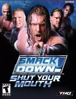
This cover certainly stands out as it is so ‘’in your face’’ which is perfect for the title. It also has some of the biggest stars at the time but there is one superstar omitted that clearly should have been the focal point. ‘’Shut your mouth’’ is part of The Rock’s catchphrase but he is nowhere to be found on the cover.
He has been part of every cover, up until that point. The titles of each game back then have come from The Rock so how can you not have him be part of this image? That would be the only thing needed to make this cover a lot higher on the list.
11. WWE SmackDown vs. Raw 2008
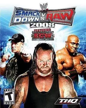
WWE SmackDown vs. Raw 2008 was the first game in which they featured ECW, and they had the biggest star of each brand on this cover which is the perfect way to go. Although Bobby Lashley departed the company not long after this, he was the face of the modern ECW so he was the right star to represent the brand on the cover.
One thing they could have focused on was the different classes of superstars which is what the marketing of the game was focused on (brawlers, high flyers, dirty, etc) They could have also added just a little more with the background, as it is only blue, which is a Smackdown color.
10. WWE 2K19
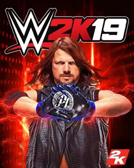
Keeping in line with the previous year, WWE 2K19 had a fresh face and one of the most popular superstars in the world for the cover, AJ Styles. No one ever thought Styles would come to WWE, become World Champion, defeat John Cena, and be one of the most beloved stars in the company.
No one also thought that Styles would ever be on the cover of a WWE game, and all of that happened in a very short amount of time. Styles also mentioned in interviews about wanting to be on the cover, so it was fitting that it happened for WWE 2K19.
9. WWE 2K15
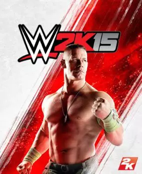
John Cena has been part of many game covers before this but he never had his solo 2K cover yet, so it seemed appropriate for Cena to take this for the year.
WWE 2K15 was also the first game to be released on the PS4 and XBOX ONE, and what better way to market it than the face of the company at the time, that was still going strong every single week? The design itself is sleek and clean, with bright colors which fit the Superstar and the game.
8. WWE SmackDown vs. Raw 2007
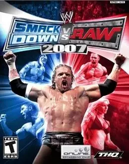
You have the blue and red colors for each brand with a few stars showcased in the background, and having Triple H with his signature pose makes for a bold and iconic image for WWE Smackdown vs. Raw 2007.
There may be a lot of elements involved here but it all blends together with the color palette, the appropriate superstars involved, and HHH looking badass at the forefront.
7. WWE SmackDown vs. Raw 2010
WWE Smackdown vs. Raw 2010 could be viewed as the ‘’Shut your mouth’’ cover for this era as you have the biggest stars at the time all involved in a similar manner.
The color contrast also is quite striking as it gives more of a spotlight to the stars showcased on the cover. I also love the filter used for the superstars, it is subtle but very effective. The theme of the game was to become a superstar, and what better way to highlight that than having the biggest stars at the time for the cover.
6. WWE 2K20
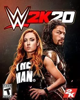
Say what you want about WWE 2K20, but the cover was a breath of fresh air for 2K. It was refreshing to see the standard solo cover formula being switched up for this year. This was also the first time that a woman has been the primary focal point of the cover without being overly sexualized, which is long overdue - and no one was more prominent at the time with the fans than ‘’The Man’’, Becky Lynch.
It was also Roman’s first game cover, which seemed to be long overdue considering he’s been the face of the company for years at that point. 2019 was the year that women main-evented Wrestlemania for the first time in history, and fans were clamoring for Becky to be the cover star after that, and 2K obliged.
5. WWE SmackDown! Here Comes The Pain
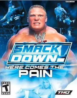
The very first title in the series to stray away from one of The Rock’s catchphrases as all the focus on here is The Beast Incarnate, Brock Lesnar. ‘’The Next big thing’’ was what Paul Heyman labeled Lesnar as, and what better way of proving that than having him be the cover star?
Lesnar was pushed to the moon in his first tenure in WWE, so it was wise of THQ to capitalize on the hype and have Brock be the new face of the series. It was something new at the time, it was promoting a young and fresh talent, and it is now one of the most iconic Video Games in PlayStation 2’s history.
4. WWE Smackdown! vs. Raw 2006
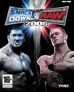
Now this is how you promote the theme of ‘’Smackdown vs. Raw’’. A massive upgrade from the previous year and you have two of the biggest stars of their respective brands on the cover, with the appropriate colors to represent the shows.
It was a new era in WWE and the cover of the game perfectly symbolizes that change. Sometimes, simple is all you need to make something stand out as ‘’less is more’’ and this is exactly what this cover did. It is not very flashy or crowded. It is straight to the point, bold, and has all the elements you need.
3. WWF SmackDown! Just Bring It
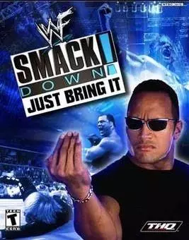
Speaking of straight to the point, you have The Rock’s catchphrase in the title, you have the Rock doing his signature pose to symbolize ‘’Just Bring it’’, you have the color blue for Smackdown, I mean what more can you ask for?
This is the most consistent correlation between the title and the cover in the series. There is also a clear focus on one star here compared to the previous years when they had so many superstars on the cover, which took attention away from The Rock's spotlight.
2. WWE ‘12
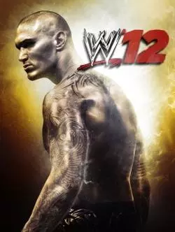
WWE ‘12 signified a new era of WWE Games and set the template for the next decade+ of Covers. The tagline was ‘’bigger, badder, better’’ and with the image of Randy Orton along with the golden-esque background was simply badass.
Just like the gameplay, the cover felt different at the time. This completely changed the formula and color scheme. No more blue, red, black background, as they went with a color that symbolizes importance, royalty, specialness and vibrance. Orton is already one of the coolest superstars in WWE history so everything in this image comes together perfectly to create something unique.
1. WWE ‘13
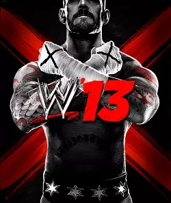
The year after, we had WWE ‘13 which I believe even surpassed the previous cover. CM Punk was in the middle of his record-breaking WWE Title reign, and Punk is known to be a controversial figure in Wrestling, THQ fed into that by making a cover that looks like a poster for a cult leader. Once again, fitting for Punk and his character with his theme song even being ‘’the cult of personality.’’
The ‘’story mode’’ for the game focused on the Attitude Era, and there is no one in WWE at that time that showed more attitude than CM Punk, as he would have fit right in with that era. One of the main marketing lines was ‘’Live the Revolution’’ which is what the poster captured with its cult-like feel and aesthetic with Punk feeling like a larger-than-life figure.
There has never been a cover or marketing campaign like this for any Wrestling game as this is not just a picture with a Superstar posing, it is an entire story in one image. So for me personally, it tops the list as being the greatest WWE Video Game Cover in history.
As stated at the beginning, everyone will have a completely different opinion than this list, so feel free to state your list of WWE game covers.
What do you think is the best and worst cover of all time? And what are your thoughts on the list presented here? Comment below!